With the recent updates to the ADA accessibility guidelines there is a lot of confusion about how they pertain to kiosks and what the changes means for deployers. This article attempts to remedy that by explaining how to apply them during the design and deployment process.
The main things to consider regarding ADA accessibility are the positioning of the interface components in relation to the user (by user the ADA is mostly concerned with wheelchair bound users). The placement of these elements is determined by height, set-back and how the wheelchair user will position themselves when interacting with the screen and peripherals (such as a card-swipe or receipt printer for example).
The two important dimensional considerations areheight of the screen’s interface elements above the finished floor and the reach required to access them.
This is often expressed as height and depth (or set-back).
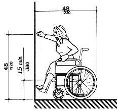
The third important variable to consider is how the wheelchair user will position themselves when interacting with the kiosk. Specifically whether they will be interfacing with the device via Front

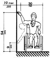
Approach or Parallel Approach. With a Front Approach they interact with the kiosk feet first much like sitting at a table, see figure 1. With a Parallel Approach they turn their body 90° to access the device, see figure 2. Each approach type has it’s own distinct reach requirements for depth and height.
NOTE: While Figure 2 shows a maximum height of 54” the 48” maximum for onscreen interface elements supersedes this. So do NOT place your interface elements above 48” even if you are configured for Side Approach!
The ADA guidelines has a nice table to help you work out the required height and setback for Parallel Approach in section 4.34.3 Reach Ranges. See below.
If only a Parallel Approach is possible, operable parts of all controls shall be placed as follows:
|
Reach Depth |
Maximum Height |
||
|
Inches |
Millimeter |
Inches |
Millimeters |
|
10 |
255 |
54 |
1370 |
|
11 |
280 |
53.5 |
1360 |
|
12 |
305 |
53 |
1345 |
|
13 |
330 |
52.5 |
1335 |
|
14 |
355 |
51.5 |
1310 |
|
15 |
380 |
51 |
1295 |
|
16 |
405 |
50.5 |
1285 |
|
17 |
430 |
50 |
1270 |
|
18 |
455 |
49.5 |
1255 |
|
19 |
485 |
49 |
1245 |
|
20 |
510 |
48.5 |
1230 |
|
21 |
535 |
47.5 |
1205 |
|
22 |
560 |
47 |
1195 |
|
23 |
585 |
46.5 |
1180 |
|
24 |
610 |
46 |
1170 |
Exception: Where a function can be performed in a substantially equivalent manner by using an alternate control, only one of the controls needed to perform that function is required to comply with this section. If the controls are identified by tactile markings, such markings shall be provided on all controls.
Determining which approach is suitable for your application is driven by dwell time and the installation site. Longer dwell times (more than @2 minutes) are better served by a front approach that is more comfortable for the user while shorter dwell times (@2 minutes and under) can be served by side approach. These dwell time guidelines are not part of ADA but are general recommendations for best industry practices. Side approach also tends to be easier to implement as it has less demanding site requirements (the user does not need to put their feet under the kiosk so the design and placement of the kiosk is more flexible).
An example of how the ADA guidelines can be applied to kiosks are Lilitab’s range of tablet & iPad kiosks. Our Lilitab Floor kiosk conforms to the ADA guidelines for Front Approach keeping all interface elements below 48”, while our Surface, Wall and Counter units will conform provided they are mounted at the correct height and set-back requirements. The tilting feature found on the Pro line helps optimize for ergonomic and ADA purposes.

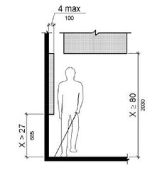
One more thing to consider for wall mount units is the  ADA requirement for the blind and partially sighted to be able to detect protuberances from walls with their canes. This requirement stipulates that nothing can protrude into a walkway more than 4”. You can resolve this by either using a wall mount unit that protrudes less than the mandated 4”, such as our our Lilitab Picture Mount Pro unit that can hold almost any 10” tablet and protrudes less than 2” from the wall. Alternately you can created a “cane guard” on the floor that will allow a cane user to detect the presence of the protuberance before they walk into it.
There are some ancillary ADA requirements that may or may not apply depending upon deployment scenarios such as:
Font sizing and contrast for on-screen and printed instructions.
Audio guide option for the hard of hearing (an audio jack the user can plug their own personal headphones into).
Braille labeling on physical buttons and on printed instructions affixed to the kiosk.
Those ancillary requirements can be quite important in themselves and warrant their own future guide.
Best of luck with your ADA compliance efforts!
If you have any questions, suggestions or amendments to this guide shoot us an email at info@lilitab.com.


